
Logos Don’t Blink. Companies Do.
Dec 18, 2025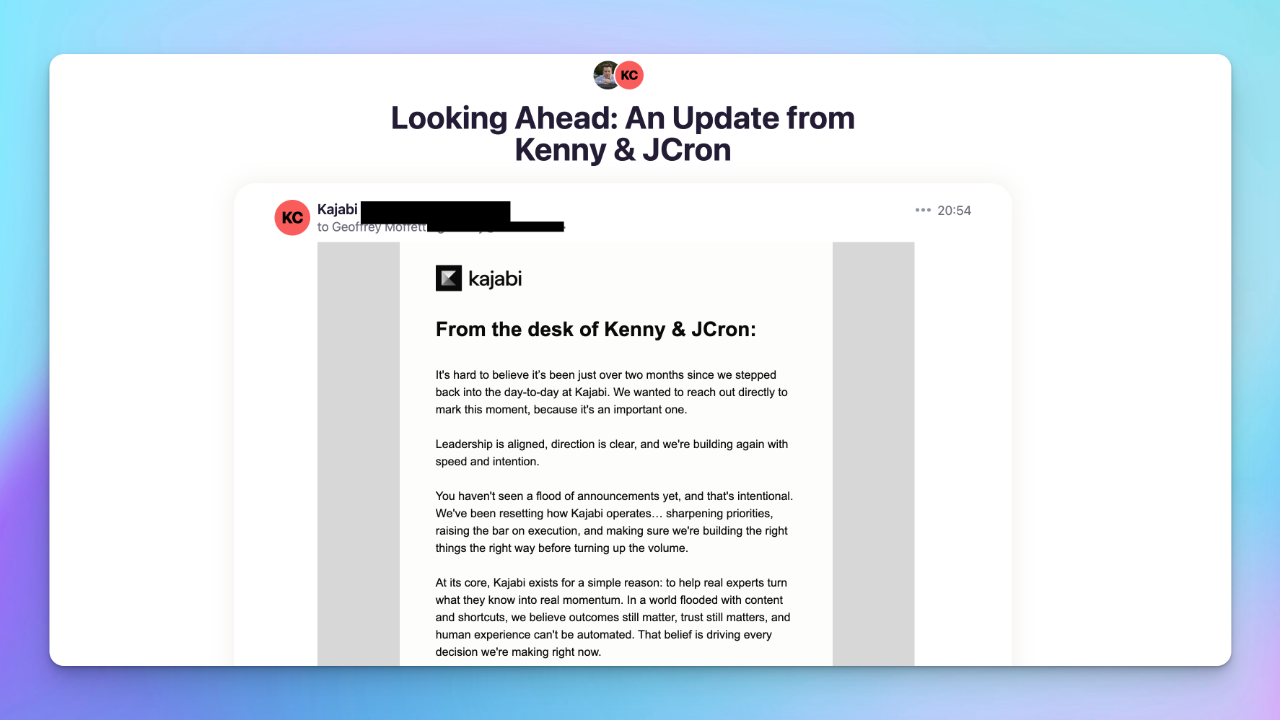
Kajabi might be changing its logo again.
Not with a big announcement. Not with a splash page. Just a quiet swap. A different mark sitting at the top of an email. Another one tucked into the footer. Easy to miss. Hard not to notice if you care about these things.
The hint came at the end of today’s email:
“P.P.S. If something looks a little different at the top of this email… good eye. January’s going to be fun.”
That’s usually not how stable things talk.
The Last Rebrand Was Loud
Back on October 15, 2024, Kajabi rolled out a new logo and wordmark with a lot of explanation. Maybe too much.
It was a story about paths and momentum and optimism. A flowing shape. A winding journey. A “K” hidden in motion. Curves echoing curves. Meaning layered on meaning.
It wanted to say everything at once.
Personally, I never liked it. Not because it was bad design. Because it felt busy. Earnest. Overexplained. Like the logo was trying to do the job of the product.
Logos shouldn’t need a paragraph to work.
This Change Feels Different
What’s interesting now isn’t the logo itself. It’s the timing.
Kenny and J-Cron are back. Leadership is “aligned.” Direction is “clear.” Those words showed up for a reason. You don’t say them unless they were missing before.
The email reads less like marketing and more like housekeeping. Resetting how Kajabi operates. Sharpening priorities. Raising the bar. Building quietly before talking loudly.
That’s not a rebrand message.
That’s a we’re taking the wheel again message.
When Founders Return, Design Often Follows
Founders tend to have a longer memory. They remember why things looked the way they did before the committees arrived. They remember what felt right, not just what tested well.
So when a logo changes shortly after founders step back into the day-to-day, it’s rarely about aesthetics.
It’s about reclaiming the voice.
Sometimes that means undoing things. Simplifying. Going back to something more familiar, more grounded, less symbolic, more direct.
Rebrands are easy.
Un-rebranding takes conviction.
Quiet Signals Matter More Than Announcements
What I like most about this possible change is how it’s happening.
No press release.
No redesign case study.
No manifesto about kerning.
Just a subtle “good eye.”
That’s confidence. Or at least restraint.
If January really is going to be “fun,” it won’t be because of a logo. It’ll be because the product gets clearer, the communication gets sharper, and the company remembers who it’s for.
Logos don’t build trust.
Shipping does.
And if Kajabi is blinking right now, that’s not a weakness.
That’s a sign someone’s paying attention again.
Get The Inside Scoop With 'Simply Digital'
Tired of the same old, same old? Every Monday morning, we’ll drop fresh takes on social media, content strategy, and digital marketing straight into your inbox—no fluff, just stuff that actually works!
We hate SPAM. We will never sell your information, for any reason.
Author