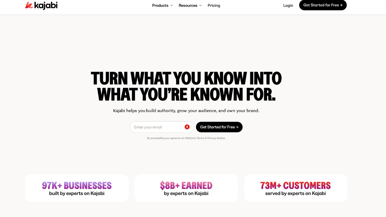
Kajabi Is Changing Its Logo. That Matters More Than It Sounds.
Jan 05, 2026
Logos usually change quietly. A refresh here. A tweak there. Most of the time, it is cosmetic.
This one is not.
At the end of last year, Kajabi sent an email from Kenny and JCron that did not read like a design update. It read like a reset.
“Beginning in January, Kajabi enters a more public, more active building phase… with clearer communication, faster shipping, and a higher bar for what we put in front of our Heroes.”
That sentence does a lot of work.
This is not about a logo
When a company changes its logo, it is rarely the starting point. It is usually the signal that something else has already changed internally.
Priorities.
Pace.
Standards.
Kajabi is stepping into what it has described as a more visible, more active phase of building. That suggests it is done quietly iterating in the background. Progress is no longer meant to be hidden. Momentum is meant to be felt.
A new logo is simply the most obvious signal that this shift is real.
The timing matters
This is happening at the very start of 2026. Not mid-year. Not after a major launch.
January is when platforms either coast on last year’s success or make it clear they are serious about what comes next. Kajabi is choosing the second path.
They have also pointed people back to their Manifesto. That is another signal worth noting. Manifestos are not written to explain surface-level changes. They exist to align teams and users around direction and intent.
The logo sits downstream of that thinking.
Faster shipping changes expectations
One line in that email stands out more than the rest.
“Faster shipping.”
That is not marketing language. It is an operational promise.
For course creators and digital business owners, speed matters. Not noise. Not endless features. Progress.
When a platform commits publicly to shipping faster, expectations shift on both sides. Users expect momentum. The company accepts pressure to deliver.
A logo refresh in this context is less about looking modern and more about drawing a line between the old pace and the new one.
A higher bar is the real upgrade
“A higher bar for what we put in front of our Heroes.”
That sentence quietly carries weight. It suggests that not everything gets shipped anymore. Not everything makes the cut.
As platforms grow, the temptation is always to add. More features. More settings. More complexity.
Raising the bar usually means the opposite. Fewer things, done better. Clearer decisions. Stronger defaults.
If Kajabi follows through here, the logo will come to represent restraint and focus rather than expansion for its own sake.
The year has begun
Today is 5 January. For most businesses, this marks the real start of the new year. With Kajabi signalling urgency and clearer communication, it would be reasonable to expect to hear more from the co-CEOs this week as that next phase begins.
This is the moment when intent turns into action.
What this means for creators
If your business runs on Kajabi, this change matters.
Not because of colours or typography.
But because it points to a platform trying to lead again, not just maintain.
Clearer communication helps creators plan.
Faster shipping keeps tools relevant.
A higher bar protects users from clutter.
The logo is simply the flag being planted to say this is a new phase.
Watch what comes next
The real test will not be the logo reveal. It will be what follows.
Do updates arrive more often?
Does communication improve?
Do changes feel intentional rather than reactive?
If the answers are yes, the logo will fade into the background and the progress will take centre stage. That is usually how you know a rebrand has worked.
Not when people keep talking about it.
But when they no longer need to.
Get The Inside Scoop With 'Simply Digital'
Tired of the same old, same old? Every Monday morning, we’ll drop fresh takes on social media, content strategy, and digital marketing straight into your inbox—no fluff, just stuff that actually works!
We hate SPAM. We will never sell your information, for any reason.


